From origami to pharmaceutical sourcing, and why a ‘good team makes good stuff’.
We are building a new Pharmaoffer Brand Book. Here is a quick look at how we are evolving:
- The Goal: We are turning complex market data into a simple, human-centered experience.
- The Inspiration: Designer Anne Noteboom uses the logic of origami to bring structure and precision to our platform.
- The Design: We are moving from rigid, square layouts to a calmer, more intuitive interface.
- The Details: New rounded corners and micro-animations will make sourcing easier and more reliable.
- Status: This new look is out, and more updates are coming.
At Pharmaoffer, our mission is to provide the best sourcing service in the market, backed by data and full transparency. To achieve this, we often rely on the metaphor of a driver who safely guides people to their destination. By simplifying the complex regulations of pharmaceutical trade, we connect companies so they can work together to create the medicine that helps the world.
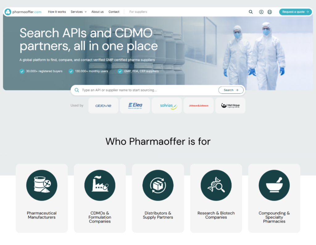
A truly global service requires more than just a functional platform. It’s about leveraging technology and deep data to create the highest level of support for our users. After years of building a database rich with market insights, including real-time API prices and global import/export trends, we are now developing a new user experience. This design will translate our industry knowledge into a clear, intuitive interface that simplifies the sourcing journey.
To lead this transformation, we onboarded Anne Noteboom, the UX designer currently reshaping our brand book. We sat down with her to discuss her design background, her creative inspirations, and how she navigates the industry’s complexities to create a seamless experience – one that will soon be released to our users.
‘Interestingly, the logic of origami, transforming a simple sheet into a complex, purposeful structure, is exactly how she approaches web design: taking a blank canvas and building a structured, functional environment.’
From Origami to Web Design: Anne’s Journey
Anne’s path to digital design began far from a computer screen. Her approach to design is rooted in a unique blend of precision and creativity. Long before she was building digital interfaces, she spent years mastering the art of origami.
“I really did a lot with paper… for years and years,” Anne shares.
But her creative energy doesn’t resume to that. Anne’s adventurous spirit, seeking out new environments and nature, is balanced by a disciplined gym regimen. For her, the gym provides the “basics,” or the foundational strength required for the “hikes” of her life. This same balance of discipline and exploration defines her professional work. Interestingly, the logic of origami, transforming a simple sheet into a complex, purposeful structure, is exactly how she approaches web design: taking a blank canvas and building a structured, functional environment.
The Natural Challenges of a Traditional Industry
The pharmaceutical industry is notoriously “rigid” and traditional. As Anne told us, unlike some of her past projects, like designing for holiday homes or lifestyle brands, pharma doesn’t come with a modern aesthetic to drive a lot of inspiration.
“For pharma, you don’t have really inviting photos,” Anne explains. “The design solution had to be calm and trustworthy… not ‘smooth and catchy,’ because it has to handle large amounts of information.”
According to Anne, the old Pharmaoffer platform was functional but lacked a cohesive visual story. We had a “square” design – sharp edges, inconsistent button colors, and no clear guidance. In an industry where trust is the primary currency, these minor inconsistencies matter and drive impact.
The Strategy: Human-Centered Sourcing
“The design solution had to be calm and trustworthy… not ‘smooth and catchy,’ because it has to handle large amounts of information.”
Anne’s goal was to take our “traditional” foundation and update it with a cleaner, more strategic approach. The redesign isn’t about being eccentric; it’s about being Human-Centered.
- Softening the Experience: We moved away from the rigid, square blocks of the past. By introducing rounded corners on buttons and sections, the interface instantly became more inviting and accessible.
- Creating a Visual Hierarchy: Instead of thick, heavy borders that clutter the screen, Anne used subtle background colors and darker contrast sections to guide the eye.
“By adding a section with a darker color, you create the contrast. Okay, now you’re on a new part of the website.”
- Feedback and Flow: In a complex B2B transaction, the user needs to know they are safe. Anne introduced micro-animations that guide the user creating a seamless navigation. According to her experience these minimal details, those small elements make it less frustrating for the user.
A good team makes good stuff
A brand book is only as strong as the team that implements it. Anne highlighted that the success of this redesign stems from the transparency and communication within the Pharmaoffer team – from the developers to the product owners.
As Anne puts it: “A good team makes good stuff.”
Our goal with this design evolution is simple: to better support the people who keep the global supply chain moving. By introducing a calmer, more intuitive interface, we are making it easier for our community to navigate the complexities of pharma sourcing with confidence.
While the elements discussed here form the foundation of our new brand book, not all the new updates are out yet. We are committed to refining this experience to ensure it meets the high standards of the pharmaceutical community.
We will continue to share updates on our progress and give you further “behind-the-scenes” looks at our evolution. To receive the latest market insights and platform updates, subscribe to our newsletter below.
Access exclusive insights on global API pricing, export/import transactions, competitor activities and market intelligence.